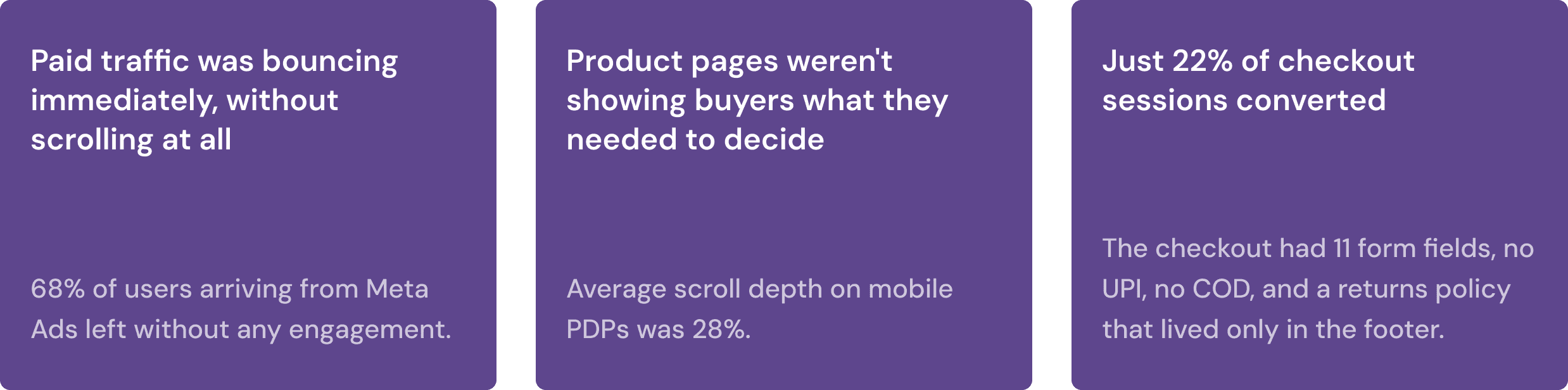
Traffic was there. Buyers weren't converting.
The first thing I did was use the site as a buyer would - on my phone, without any context. I could feel immediately that something was off. The nav had nested dropdowns that took multiple clicks to get anywhere. Product pages were heavy with text and light on the specs that actually matter when you're deciding whether to buy a mouse. The checkout felt sparse and unfinished for a brand trying to establish trust with first-time buyers.
Then I pulled the data. It confirmed what I felt, and added more problems I hadn't spotted yet.

BACKGROUND AND CONTEXT
Traffic was there. Buyers weren't converting.
The first thing I did was use the site as a buyer would - on my phone, without any context. I could feel immediately that something was off. The nav had nested dropdowns that took multiple clicks to get anywhere. Product pages were heavy with text and light on the specs that actually matter when you're deciding whether to buy a mouse. The checkout felt sparse and unfinished for a brand trying to establish trust with first-time buyers.
Then I pulled the data. It confirmed what I felt, and added more problems I hadn't spotted yet.
THE PROBLEM
Traffic was there. Buyers weren't converting.
The first thing I did was use the site as a buyer would - on my phone, without any context. I could feel immediately that something was off. The nav had nested dropdowns that took multiple clicks to get anywhere. Product pages were heavy with text and light on the specs that actually matter when you're deciding whether to buy a mouse. The checkout felt sparse and unfinished for a brand trying to establish trust with first-time buyers.
Then I pulled the data. It confirmed what I felt, and added more problems I hadn't spotted yet.
MY APPROACH
Two weeks of research before a single wireframe
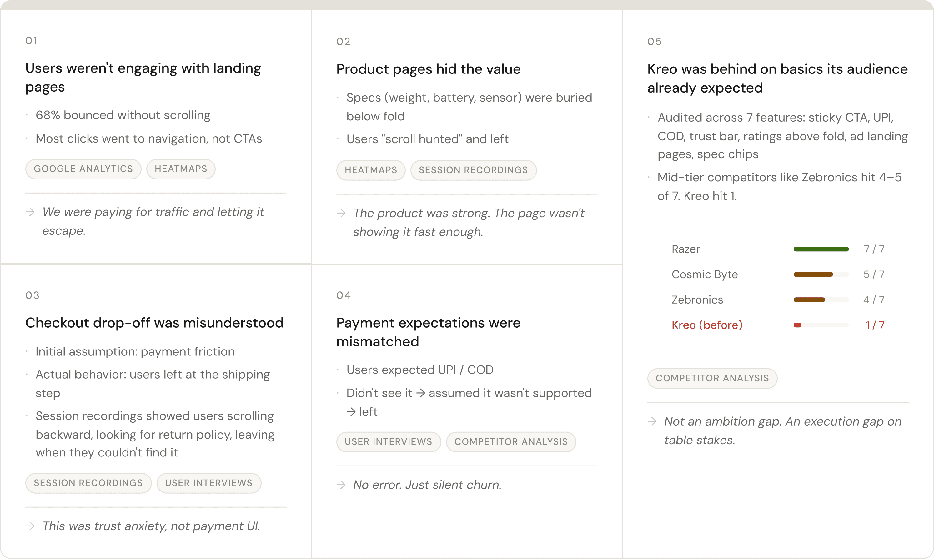
In a fast-moving environment with no testing infrastructure, the cost of shipping the wrong thing was high. So I spent the first two weeks doing nothing but research across five methods - each one answering a different question.
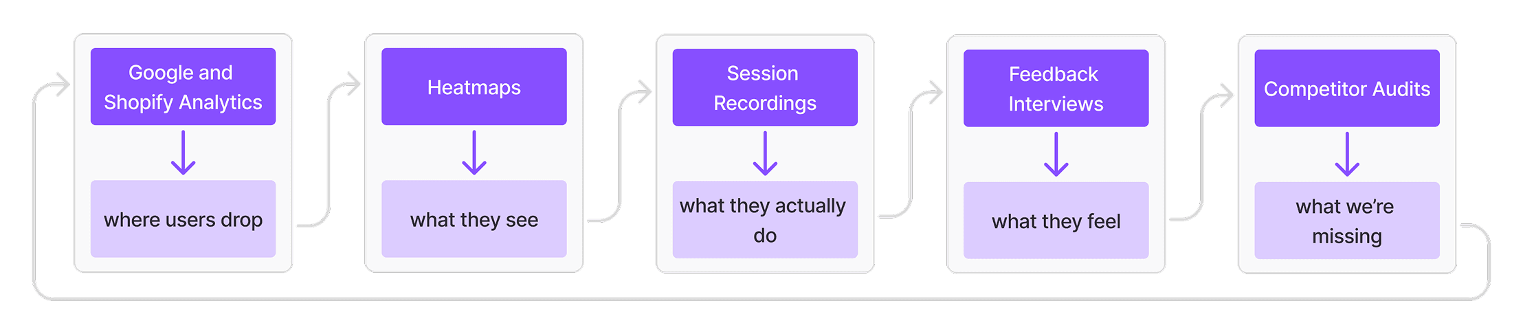
The most important thing research did was correct a wrong assumption. Everyone on the team believed checkout was dropping at the payment step. Session recordings and user interviews showed it was dropping at shipping — people were scrolling backward through checkout looking for the returns policy before they'd commit to paying. If I'd gone straight to redesigning the payment UI, I'd have missed the actual problem entirely.
"The goal wasn’t validation. It was to find what we were wrong about."
UI AUDIT
KEY INSIGHTS
The strategy wasn't to redesign Kreo's website. It was to remove the specific things that were stopping buyers who already wanted to buy.
Instead of redesigning everything blindly, I split the problem into 3 high-impact surfaces
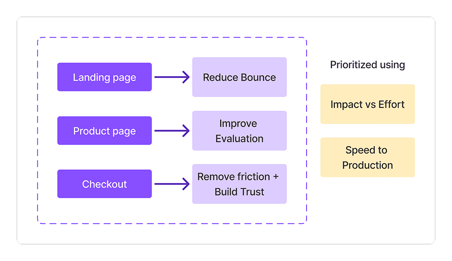
SOLUTION
*Discliamer: I iterated on this for 3 months regularly changing what did and didnt work. This solution here is a result after multiple iterations. Since 95% of teh traffic came rom mobile I focused on making the mobile verison perfect
Landing Page
BEFORE
AFTER
Rebuilt the page as an active conversion surface
Flat nav, one click to any category
Top announcement bar for promotions
Campaign hero with discount codes
Category grids → horizontal sliders
Ratings, wishlist + add-to-cart on cards
"Shop the Setup" cross-sell section
Instagram UGC feed embedded
Chatbot added
Footer updated
Product Page
BEFORE
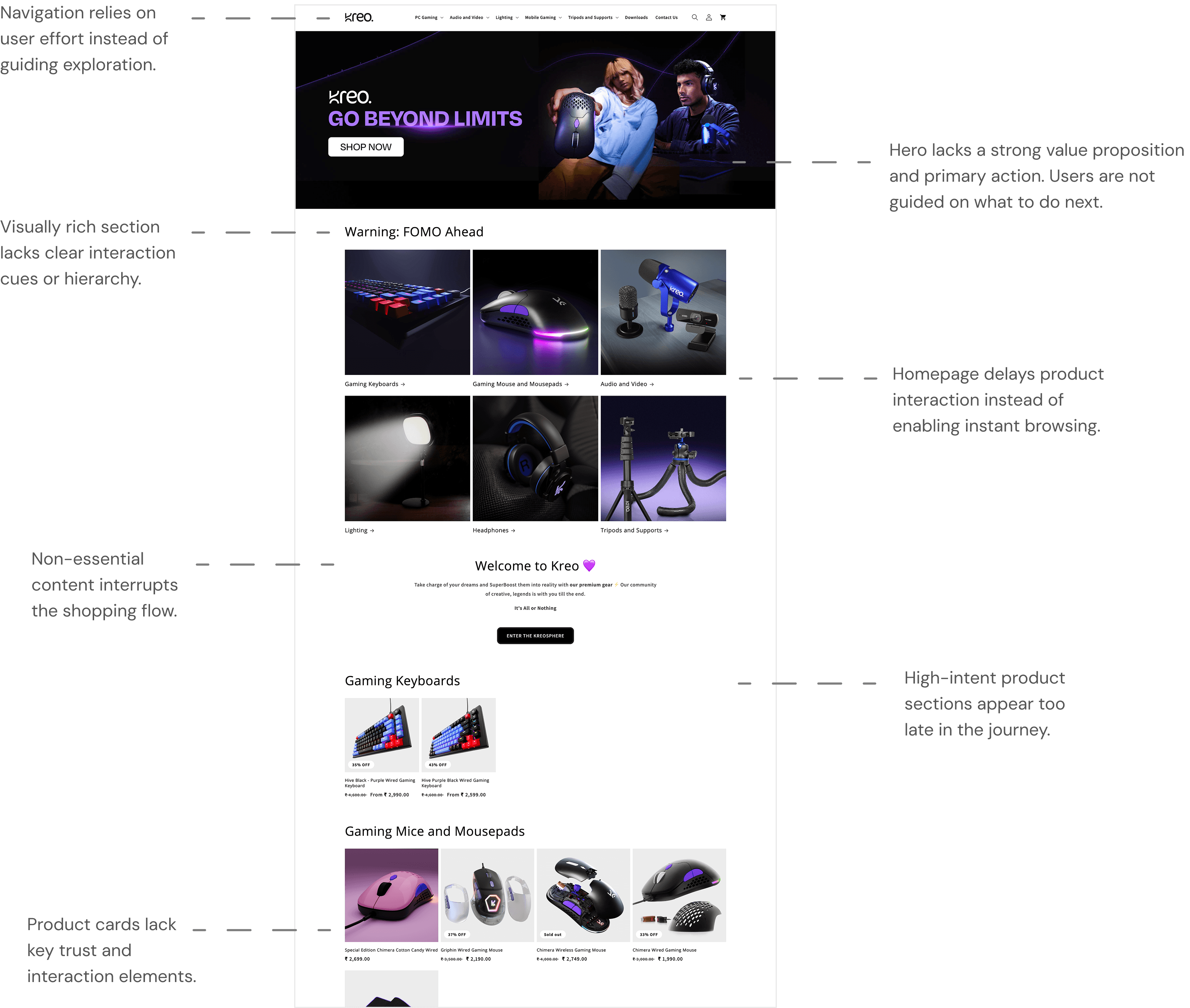
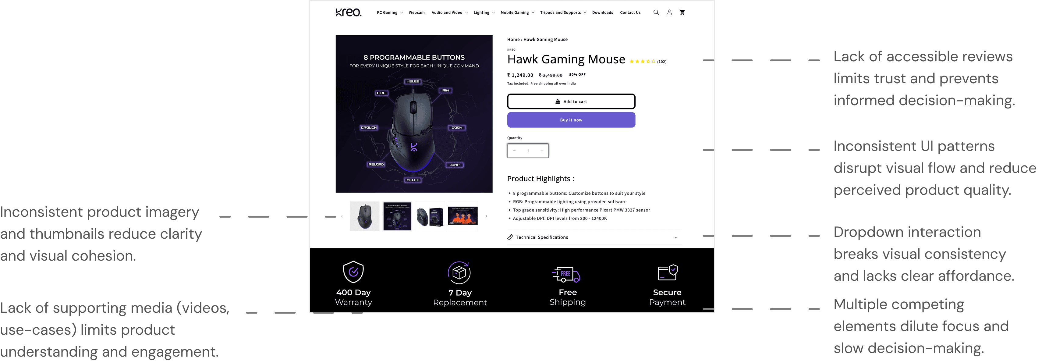
A site that looked like it was built to launch, not to sell
Nested dropdown nav buried products behind multiple hover states
Generic hero with no offer, no urgency, no specific product
Product cards showed image + price only — no ratings, no add-to-cart
All categories stacked as long vertical grids — page felt endless
No promotional hooks, no community proof, no cross-sell
Rebuilt the page as an active conversion surface
Flat nav, one click to any category
Top announcement bar for promotions
Campaign hero with discount codes
Category grids → horizontal sliders
Ratings, wishlist + add-to-cart on cards
"Shop the Setup" cross-sell section
Instagram UGC feed embedded
Chatbot added
Footer updated
AFTER
Checkout Experience
REFLECTION
I learned how important it is to stay organized throughout the design process i.e. keeping track of research, flows, and small decisions helped me see how everything connected.
Asking small “why” questions during research revealed pain points I wouldn’t have noticed otherwise. It reminded me that good design often starts with curiosity, not assumptions.
I realized that creating familiarity in design is powerful; by aligning my interface with patterns users already recognize, I made the experience easier to understand and trust.